UX of Digital Purge
- Rayanne Ellis
- Jun 13, 2024
- 18 min read

Unit: Micro
Team members: Srushti, Saranya, Rania, Dina, Shreya, Teddi, Swaranjali and Rayanne
Brief: Design a way to purge a digital hoard.
Company: BBC iPlayer
Dates: 18 April - 6 June 2024
Contents
Week 4: DATA PERSONIFICATION & MOULD
Week 7: THE FINAL DATA KITCHEN
WEEK 1: BRIEF FAMILIARISATION & LITERATURE SURVEY
Meeting BBC iPlayer
BBC iPlayer introduced us to the concept of digital hoarding through their evolution from a catch-up service into a video-on-demand service. They also demonstrated that people and organisations have a range of digital hoards that are visible (CDs, old phones, servers) and invisible (files, photos, emails), with no clear understanding of how they can be "purged". Following this as a group we critically explored the brief.

Fig.1 the brief with my annotations and our thoughts and questions on the left following a group review
Digital hoards definition and research
Bennekom et al suggests digital hoards are “an accumulation of digital files to the point of loss of perspective” (Bennekom et al, 2015 cited in Neave et al, 2019) This definition provided us with a lens to explore digital hoarding behaviour and what “purging" may look like.
I looked into what regulations there are around digital hoarding, what happens when we “delete” digital stuff and finally the expansiveness of digital spaces, which Dourish (2017) suggests has changed our “materialities of information” (see fig. 2). On Monday we all got together to look at our research and compared notes. I then transferred our research into a mind map for easy access throughout the project.


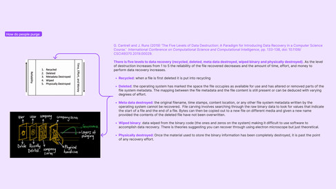


Fig. 2, 3 and 4 are summaries of key findings from readings I did as part of literature survey. Fig. 5 is a mind map of our literature survey for week one.
Body storming our brief
In Monday's seminar, we applied the Mediated Collaboration Model Wardrip-Fruin, 2013 cited in Laurel, 2014 see fig. 6) to our brief and created a plot where people's digital hoards were physically materialised, we then asked another group to bodystorm the plot. The group used their own items to represent their digital hoards physically and agreed they could only keep five things.
I learned that when instructions or props are missing, people create their own, suggesting people may not use an experience as intended by the designer. Therefore, designers should test experiences early and allow space for users to safely and enjoyably shape the experience.

Fig.6 Mediated Collaboration Model (Wardrip-Fruin, 2013 cited in Laurel, 2014)

Fig. 7 The other group bodystorming our plot and the items they kept.
Exploring peoples digital hoards
The team created a card sorting exercise, this is where participants are given a number of statements and asked to sort them into groups or rank them (Lobinger and Brantner, 2020). This was to explore what digital hoards people have, how they would categories them and what they would delete. The “plot from the body storming was utilised as a “prompt”. The session highlighted people’s preference for organisation and their apprehension around deletion.
Finally we explored our own digital hoards and realised digital hoards could be physical such as hard drives, personal or collaborative such as shared photo albums or project chats. From these activities we realised digital hoards were vast and varied, far more than files suggested in our definition and to be micro we needed to pick one to focus on.


Fig. 8 shows participants interacting in the card sorting activity and their outputs. Fig. 9 is our outputs from brainstorming our own digital hoards.
Reflections
We effectively explored concepts through secondary research and through primary research we brought them to life related them to our brief. However, I believe we could have gone more micro and explored less obvious aspects. Tonicha also noted that we lacked examples of design in practice, which I am eager to research in coming weeks. Additionally, I would like to explore the difference between organising and purging.
WEEK 2: COLLABORATIVE DIGITAL HOARDS & ARCHIVING
Exploring collaborative hoards
We decided to focus on how teams or projects collaboratively accumulate and delete data, believing this could help organisations like BBC manage hoarding and deletion behaviours.
Following this, Saranya and Srushti explored collaborative decision-making models which we role-played. The experience showed that structure aids collaboration, but the steps overlapped, and reaching a collective agreement was easy because the scenario was hypothetical and lacked emotional involvement.

Fig. 10 Shows the collaborative decision making model we selected and our findings from role playing it. The picture on the right is the role playing in action. Our prompt was to decide what clay structure to give to another team to reuse.
Digital Rites collaborative hoard
To explore collaborative hoarding and decision-making, the MA:UX Digital Rites group kindly agreed to a session to organise their shared OneDrive.
We researched methods, including creating a content inventory to map and document their OneDrive for deciding what to keep or delete and using the Mental Models method to understand the behaviour behind their decisions (Martin and Hanington, 2019). This helped us develop a process to assist them in "purging" their hoard. I also created a research guide for us to collaboratively amend and agree upon.
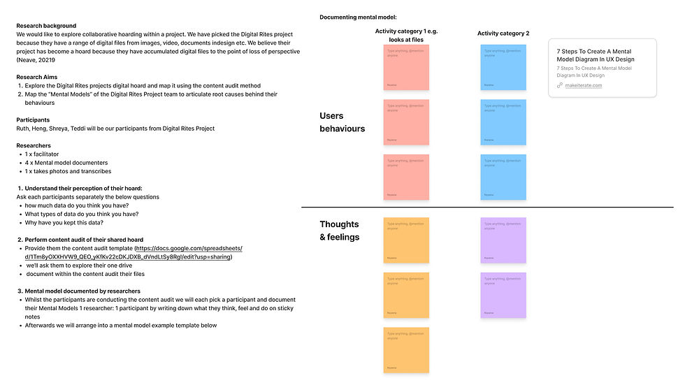
Fig. 11 the research guide for the MA:UX Digital Rites project OneDrive sorting workshop.
During the session, we assigned roles and gained insights for future improvements. We found the content inventory was not used as participants found it boring and redundant. Also, the group dynamic was unequal: Ruth felt too powerful due to controlling the computer, while Heng, being the furthest away from the computer, felt unheard. Participants ended the session frustrated, wanting more time and feeling anxious about deletion. We (the researchers) also couldn't see the computer screen interactions, missing out on useful insights.


Fig. 12 shows Teddi and Shreya's map of their Digital Rites projects OneDrive by documenting their folders and content. Fig. 13 shows how this map changed after the session. Fig. 14 demonstrates the mix of emotions in the session by the participants.
Analysis - Mental model or Journey Map?
For analysis, we created what we thought was a "Mental Model," but feedback revealed it was a journey map, outlining the teams step-by-step experience and their emotions when trying to meet a goal (Walter, 2022) in this case of “purging” their hoard. It was not a mental model, as it didn’t demonstrate the interface metaphors or cognitive frameworks used by the team to comprehend and interact with the experience (Nasrudin, 2023).
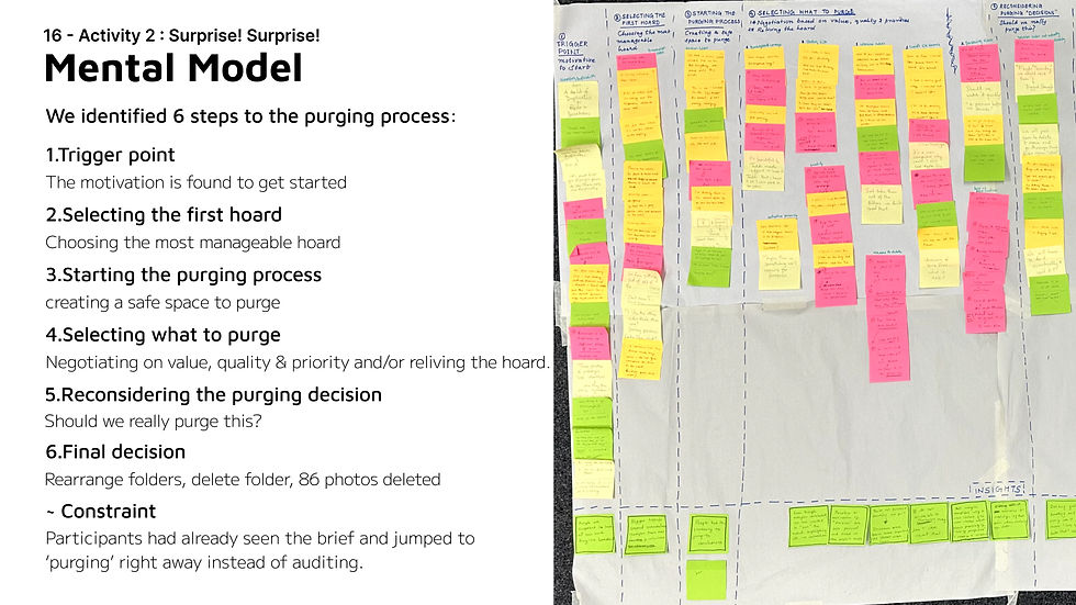
Fig. 15 shows what we initially thought was a "mental model" but was really a journey map and the 6 steps identified.
LLC Archive Centre
To explore organising versus deleting in an organisational setting, I arranged a meeting with the LCC Archive. Initially, I considered using contextual inquiry, where researchers observe participants completing tasks to uncover underlying work structures (Martin and Hanington, 2019). However, we decided as a group that an interview would be less intrusive and require less effort from participants.
From the session, we realised that archiving is not the same as hoarding, according to our definition. While an archive may appear similar to a hoard, it fundamentally differs because the structures in place ensure that archived items remain perceivable and accessible.


Fig. 16 and 17 shows aim of our session with the LCC Archive Centre. They also include Rania's diagrams synthesising the process of archiving and the difference between archiving and hoarding.

Fig. 18 shows the questions we used for session with LCC Archive and the raw findings
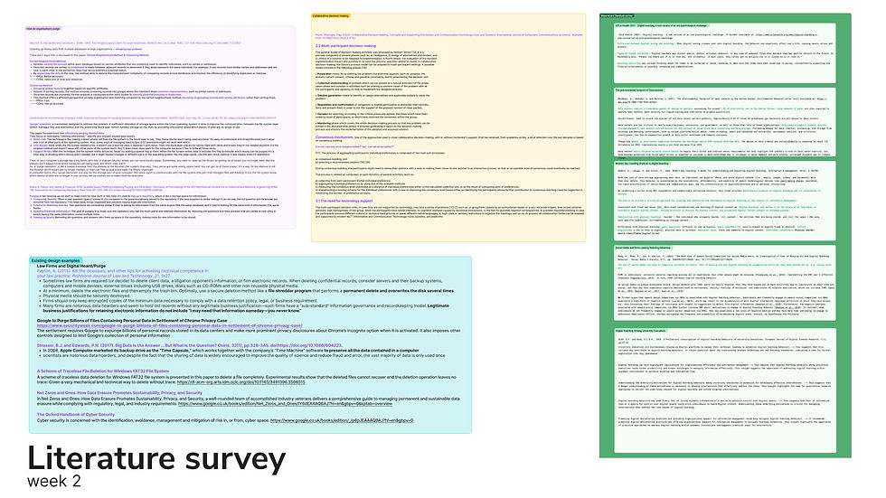
Fig. 19 additional readings on collaborative deicison making, existing design examples, why organisations purge and the effects of digital hoards on the environment and people.
Presentation feedback and reflections
People appreciated our focus on collaborative hoarding, finding it relevant to the organisation's brief. However, Alaistair suggested exploring a hoard outside of UAL for more insightful data. Alex from BBC also recommended focusing on smaller, local hoards, such as those of family and friends, instead of complex organisations like BBC to help us overcome challenges around commercial data privacy.
Additionally, our journey map (fig. 15) could have been more clear and visual to communicate our finding effectively. Finally, Ava proposed that we each take a post-it note from the journey map and develop six experience ideas, to help us use the journey map to shape an experience.
WEEK 3 HOW TO DIGITALLY PURGE, WHY & IDEATION
Ideating through Crazy Eights
Following Ava's suggestion, we used the Crazy Eights research method, generating eight ideas each in eight minutes (Maguire, 2022). This helped us identify key themes for our experience: giving people the motivation to delete and a decision-making process to simplify the deletion process. However, we also realised our ideas were broad and defining the specific’s around our hoard may help us narrow our focus.

Fig. 19 Crazy eight ideas that we were interested in including data personification and finding the value in the hoard.
Picking a hoard
We all wrote down some specific collaborative hoards ranging from collaborative fitness data to shared files, albums or friends. We voted and decided to focus on cloud based storage, which we explored with the Digital Rites group.

Fig. 20 output of brainstorming hoards to focus on
Reanalysing our journey map
Saranya and Rania reviewed our journey map and interviewed participants from the Digital Rites workshop about their emotional experience. They confirmed that participants generally had a negative experience during the purging process. This led me to consider whether we lean into this negativity or overcome it through a positive experience instead. I then revised our user journey making it more visual to aid future ideation, incorporating the decision-making model, participant actions, and their emotions.
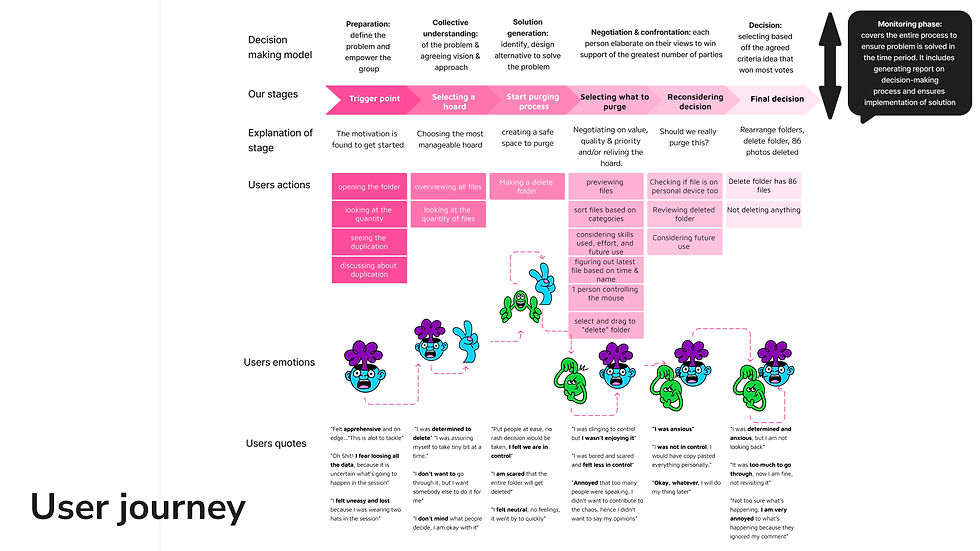
Fig. 21 iteration on user journey incorporating Saranya and Rania follow up research with participants on their emotional journey and the decision making model.
Why we need to purge
Given purging seemed like a relatively negative time consuming experience we decided to look into why purging is useful and a worthwhile, through this we learnt about the impact on peoples mental health and the environment.

Fig. 22 highlights the impact digital hoarding has on the environment and people providing reason as to why we need to purge.
Interviews with industry experts
My informal interview with a Data Manager highlighted the challenges of deleting digital data especially within cloud storage. They explained that while individuals have a right to request their data from a cloud provider like Google and have it removed the process isn't always guaranteed due to cloud storage complexities.
Teddi’s interview with a Web-Based Information Manager also highlighted how organisations manage bulk data purging by taking a small sample of a hoard, organising it and utilising the outcome on the larger hoard. Demonstrating alongside our Digital Rites workshop how “organisation" is important to the purging process.


Fig. 23 and 24 are the outputs from my interview with a Data Manager. Fig. 25 and 26 are Teddi's outputs from the interview with a Web-Based Manager.
Presentation feedback & reflections
We struggled this week to move beyond research into design which was evident in the presentation. Some suggested examining physical hoards for a fresh perspective, while others felt our process was impressive but could be more tangible and physical, resembling a user experience project rather than service design.
We were also advised to be more specific about our audience and to broaden our understanding of "digital," noting that it includes devices like digital cameras, not just the cloud.
Reflecting personally, I found that focusing on businesses collaborative or project-based hoards was helpful but limiting. It was difficult to find hoards users would be willing for us to explore and to move from research into the ideation phase. Stepping back to consider a variety of hoards might help us progress in novel ways.
WEEK 4: DATA PERSONIFICATION & MOULD
Review of research
After the presentation, I reviewed our work, extracted key findings, and created "how might we" questions to aid design ideation. This helped narrow our research to key themes and prepare our mid-point review presentation. However, I believe that conducting this review as a team using affinity sorting would have been more critical and objective, possibly highlighting overlooked themes.

Fig. 27 my review of our research and questions for ideation
Competitive analysis workshop
Mor Bakal ran a workshop on Competitive Analysis to help us explore our briefs. Shreya and I decided to step away from digital hoards and examine physical hoards instead. I investigated donated clothes, and Shreya looked at food waste. Although our competitive analysis wasn't correct since we compared different areas (donated clothes, food waste, and digital cleansing apps), it provided a fresh perspective, particularly on the concept of expiration.

Fig. 28 Teddi, Shreya and my outputs from the competitive analysis workshop looking at food expiration, packaging, clothes donation and digital deletion apps.
Ideation
We split into groups to explore different ideas. Rania and I revisited our Crazy Eights findings and developed concepts around data personification and collective decision-making. Shreya explained how she wanted to go deeper into mould and food expiry, while Saranya and Srushti discussed a scale to measure the carbon impact of hoarding and purging. We shared our ideas with BBC and Alex recommended using metaphors for reframing and developing our ideas further.

Fig. 29 Rania and my ideas on data personification and collective decision making when purging a hoard.
Data personification & mould ideas
We narrowed our focus to prototyping data personification and data moulding concepts. We believed data personification could address the negative emotions found in the Digital Rites project's purging process by making it easier for people to let go. In contrast, data moulding could motivate people to purge, linking to the first step in our user journey. Saranya suggested this could represent a paradigm shift, which is when the social norm of how things are fundamentally change (Meadows, 1999). In our case from default storage and preservation to default data moulding and deletion, with preservation becoming a manual process.
For data personification, we explored a physical hoard using the MA:UX Storage room, which met our definition of a loss of perspective of the boxes contents, making items hard to find. We used creative technology techniques, including a beard board, audio messages, and Arduino coding. When objects were touched, voice messages played, explaining why the item should be discarded.

Fig. 30 image of our talking physical hoard and MA:UX course members exploring the hoard
Fig. 31 video of talking physical hoard demonstrating how we used voice recordings to encourage people to bin items.
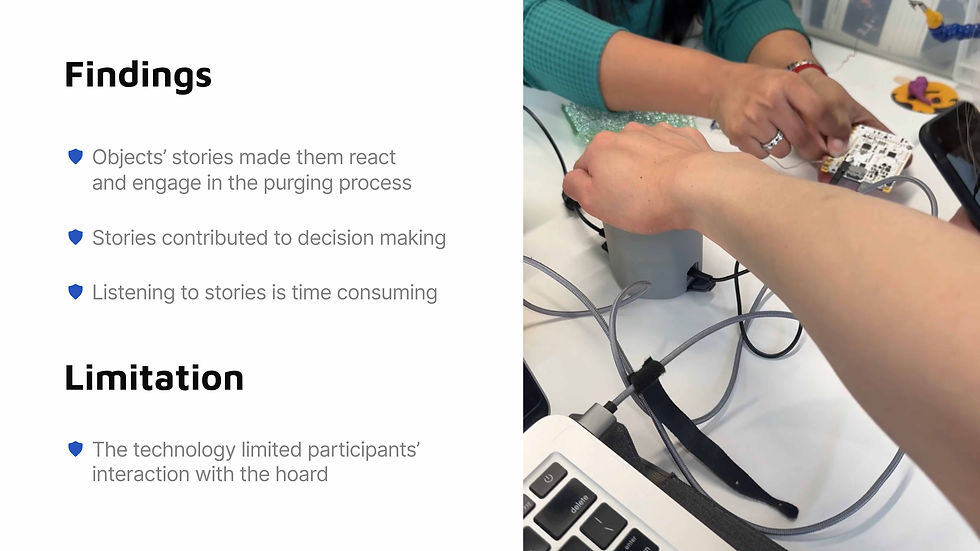
Fig. 32 findings from testing with MA:UX participants. The picture on the right shows Swaranjali and Teddi putting together the technical aspects of the talking hoard.
The mould group created pixelating images with glitching noises, setting a 1-minute expiry that caused the images to disintegrate into blackness.

Fig. 33 on the left is the pixelating images laid out for testing and on the right the ideation behind the data moulding idea.

Fig. 34 findings from testing the data moulding with MA:UX participants
Reflections & Presentation feedback
I enjoyed looking beyond our brief by exploring food expiration and physical hoards, ideating through hands-on activities. As a result, we've now explored three different hoards: collaborative clouds (OneDrive), physical hoards (storage room), and digital photo albums. I believe this variety will help us pick one hoard based on our concepts, findings and interests.
BBC shared that our research highlighted the complexity of the brief and appreciated our ability to narrow down to two main concepts. They expressed interest in how these will manifest into an experience. Tonicha and Alaistair questioned whether the design will be technological, cultural, or notional, while Inno asked if the experience should aim for purification (making data purging feel good) or simplification (making data purging easier).
WEEK 5: PROBLEM FRAMING & NARROWING OUR HOARD
Food expiry as a framework for ideation
Saranya, Srushti, and Teddi looking at problem framing through metaphors (Pee et al, 2015). They considered if expired food was "data," then organising and cleaning out food from the fridge or pantry could be seen as "purging." Rania led a fridge cleaning session to delve deeper, and Shreya created visual designs from this.
This helped us explore the food expiry concept further but we still need to clarify its relevance. As Steph Singer noted in our presentation, food expires while data does not, highlighting a fundamental difference. We need to determine if the analogy is more about how food is stored (fridge, freezer) rather than the food itself.

Fig. 35 key reading on problem framing through research into metaphors.

Fig. 36 Findings from Rania's fridge cleaning session

Fig. 37 Shreya's design ideas around the fridge
Narrowing our hoard to screenshots
The inspiration from food expiration led me to consider what digital data "expires" but still remains in cloud storage. Screenshots seemed relevant, as we often take them for specific moments, like a train journey. I also found it interesting that they exist solely in and because of the digital world. We then explored our own screenshots, mapping out key categories to understand what we screenshot, why, and how often. However, this exercise was subjective, and the categories might only apply to us. Ideally, I would have liked to speak to others about their screenshots to validate these categories. Tonicha suggested that instead of broader research, we should focus on a specific group's screenshots for the mapping exercise.


Fig. 38 explains our focus on screenshots, fig. 39 shows our mapping of our screenshots, fig. 40 links the process of cleaning the kitchen to deleting screenshots and fig. 41 shows our mapping of screenshots to items in the kitchen to explore our analogy of food being data and organising the kitchen being purging.
Ideation
We wanted to create both a digital feature and a physical experience. For the physical experience, I drew inspiration from Shreya's designs and the Data Detox Bar by Tactile Tech (2017), which uses a bar setup and cocktails to discuss data privacy and control. My question was, "How might we use our food expiry and kitchen analogies to address excessive data storage and the need to clean up to regain perspective?"
I developed a concept using a fridge/freezer that displayed items linked to specific screenshots, encouraging people to sort or delete them. This concept leverages people’s mental model of where food goes in a kitchen to help them sort their digital data.
For the digital space, Shreya designed a feature to tackle screenshot hoards by blurring out the last two weeks of screenshots until they are deleted which Dina prototyped.

Fig. 42 on the left ideation for the physical experience and on the right inspiration from the Data Detox Bar by Tactile Tech (2017).

Fig. 43 Shreya wireframes for the digital idea
Interview with UAL IT
Finally, I interviewed the UAL IT Storage team about their project to migrate UAL's digital assets from physical storage to the cloud. This research supported our earlier insights on collaborative digital hoarding and our user journey from the Digital Rites project. It also inspired me to incorporate more collaborative elements into our experience.


Fig. 44 interview guide, fig. 45 interview findings and fig. 46 shows how the session with the MA:UX Digital Rites group and UAL IT interview relate.
Reflections & Presentation feedback
I believe our ideas could be further developed, our physical concept could be more interactive and personalised and our digital concept could adopt Saranya's idea of making deletion the default and preservation a choice.
Alaistair and Tonicha also pointed out that we have lost sight of the positives of data purging, such as gaining space and being environmentally friendly. How can we incorporate this into our prototype? For example, in our food analogy, mould creates good things like cheese, could "moulding" transform data into something beneficial.
WEEK 6: CREATING OUR DATA KITCHEN EXPERIENCE
Prototyping and testing the Data Kitchen
We begun creating our physical experience: Rania and Swaranjali worked on the kitchen, a 2D setup including a fridge, freezer, pantry, shelf and bin. Saranya and Srushti designed activities to help people understand the impact of their photo album data by showcasing how much water it takes to keep the data cool and how many bread loaves could be made with the energy. I worked on creating screenshots people could organise in the “kitchen”.
After building the experience, we tested it with the public. People showed interest and understood our kitchen mental model using it to organise and delete their screenshots. However, the testing also highlighted improvements including to our onboarding and handoff process and a need to handle multiple participants simultaneously.


Fig. 48 explains of Data kitchen and shows us testing the prototype outside. Fig. 49 Shows the data used to create the water and food comparison calculations.
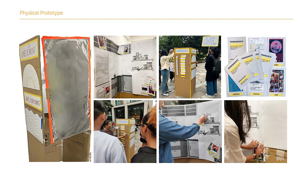
Fig. 50 images of the data kitchen prototype and testing it.


Fig. 51 our observations when testing the Data Kitchen with the public, fig. 52 the challenges we faced during testing and fig. 53 improvements to implement.
Data physicalisation of screenshots
Teddi and Shreya created a data physicalisation activity to test our screenshot categories with participants. The aim was to see how many of the participants screenshots sit in each category and what categories we are missing or what categories need changing. They did this through a physical activity using a board and counters.


Fig. 54 shows the aim of Teddi and Shreya's data physicalisation session and fig. 55 shows the findings
Evolving digital prototype
I explored evolving our digital prototype so deletion was an automated process and linked to positive environmental impacts. For example, images could gradually grow greenery over 30 days until they are fully deleted. I created a user journey and handed it over to Dina, who began prototyping.
Through this process, we realised that creating an impactful and engaging digital feature would require extensive work and testing. Additionally, linking the "moulding" process to positive environmental impact might be misleading, as it could consume more energy than simply storing the photos.


Fig. 56 wireframe ideation for changes to the digital prototype, fig. 57 improvements to the digital prototype on the left and on the right image of the clickable prototype.
Presentation feedback
During the presentation, we demonstrated our two experiences and gained valuable insights. Ananya, who tested the experience, understood the fridge and freezer but was confused about the difference between the pantry and shelf. We also realised that the first two steps—calculating the person's storage and converting it to water/bread—could be simpler, more physical, and believable.
We received advice on staging, including writing a script and emphasising the data kitchen theme more. For example, participants could have a cup of tea at the end from their "saved energy."
We were praised for our solid methodological journey, user testing, the ability to create an interactive mental model, and incorporating data personification in our facilitation. For instance, when participants placed their screenshots in the "bin," we asked if they wanted to delete them from their phone.
Finally, we found that people felt the digital and physical prototypes had different focuses and couldn't see the connection. Most people preferred the physical prototype as it was fun and engaging, Tonicha suggested incorporating some digital elements into the physical experience instead of creating a separate feature.
WEEK 7: THE FINAL DATA KITCHEN
Creating the final experience
To improve our experience, we added instructions on how to locate storage information on iPhone and Android devices. We created posters to show the data comparison between storage and water, eliminating the need for calculations, and added a physical water bottle to make the data physical and relatable.
We then made the kitchen 3D, including a fridge, freezer, shelves, and bin, to make it more realistic and engaging. To make it portable, we used corrugated cardboard, tape, Velcro, and spray painted it. Finally, Saranya drafted a script to professionalise our facilitation of the experience.
fig. 58 video demonstrating how our experience is put together with portability in mind.
Testing our experience
We tested our experience with the public by setting up on the street for passersby to stop and engage. We found the Data Kitchen was enough to trigger the purging process without the statistics, so we made this the first step in the experience. People understood the analogy and used it to organise their screenshots and photos, ultimately deleting them from their phones.
However, we realised the street is not the ideal setting for our experience. In future iterations, we would like to explore setting up in areas where people have time to kill, such as parks or airport waiting rooms.
Fig. 59 video of testing our experience on the street

Fig. 60 a map of what screenshots were placed in the fridge, freezer, bin and shelf

Fig. 61 feedback from participants who filled out the feedback sheets


Fig. 62 evidence of feedback sheets and fig. 63 quotes from people when going through the experience.
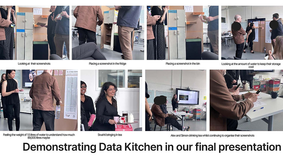
Fig. 64 is a photo journey of us presenting Data Kitchen to BBC iPlayer, we created an offboarding experience where we gave Alex and Simon both a cup of tea whilst they continued to go through their screenshots.
Reflections & Presentation feedback
We received positive feedback during our final presentation. BBC iPlayer noted that we started broad but successfully synthesised the data into an inspiring and enjoyable experience. They appreciated the communal aspect and opportunity to share stories adding a social element. I believe future iterations could elevate this further.
Simon, Director of BBC iPlayer, felt the water consumption point was powerful, raising awareness of the hidden physical cost of data consumption and making him more mindful of the "junk" on his phone. Tonicha suggested amplifying this environmental message to frame the experience.
Tonicha liked the hierarchy of information in the experience (freezer, fridge, shelf, bin), appreciating that it wasn't just about keeping or discarding items. However, she suggested the bin could be bigger and more imaginative, like a compost bin that turns into a flower, and that the kitchen could have a homelier feel with wallpaper and props. Finally, Alaistair suggested expanding the experience with other mental models, such as a picnic setup in a park instead of a kitchen.
I’ve enjoyed the journey of this brief, particularly creating an experience that impacts the digital world but happens in physical space as it fosters conversations, entertainment, and positive feelings. I’d like to implement the feedback, especially making the kitchen more homely—a plan we had but prioritised testing. I also want to explore providing statistics on energy saved with each deletion and consider Alaistair's point on using other metaphors and analogies beyond the kitchen.
References
Dourish, P. (2017) The Stuff of Bits: An Essay on the Materialities of Information. Cambridge, Massachusetts: MIT Press
Laurels, B. (2014) Computers as theatre. 2nd Edn. New Jersey: Pearson Education
Lobinger, K., and Brantner, C. (2020) ‘Picture-sorting techniques. Card sorting and Q-sort as alternative and complementary approaches in visual social research.’ In L. Pauwels & D. Mannay (Eds.), The Sage Handbook of Visual Research Methods. 2nd Revised and Expanded Edition (pp. 309-321). London: Sage.
Maguire, M. (2022) ‘A framework for user-requirements analysis and development of creative design concepts’. In International Conference on Human-Computer Interaction (pp. 97-113). Cham: Springer International Publishing.
Martin, B. And Hanington, B. (2019) Universal methods of design. Beverly: Rockport Publishers.
Meadows, D. (1999) ‘Leverage points: places to intervene in a system’. The Sustainability Institute. Available at: https://mchwdc.unc.edu/wp-content/uploads/2022/04/Leverage-Points_Places-to-Intervene-in-a-System-Meadows.pdf (Accessed 13 June 2024)
Nasrudin, N.H. (2023) ‘A Systematic Review of User Mental Models on Applications Sustainability.’ International Journal of Sustainable Construction Engineering and Technology, 14(3), pp. 376–389. Available at: https://publisher.uthm.edu.my/ojs/index.php/IJSCET/article/view/15283 (Accessed: 8 June 2024).
Neave, N., Briggs, P., McKellar, K. and Sillence, E. (2019) ‘Digital hoarding behaviours: Measurement and evaluation’. Computers in Human Behavior, 96, pp.72-77. Available at: https://doi.org/10.1016/j.chb.2019.01.037
Pee, S.H., Dorst, C.H. and van der Bijl-Brouwer, M. (2015) ‘Understanding problem framing through research into metaphors.’ In 2015 IASDR International Design Research Conference, pp. 1656-1671. Available at: https://pure.tue.nl/ws/portalfiles/portal/110349946/IASDR_Proceedings_Final_Reduced1.pdf (Accessed: 13 June 2024)
Tactical Tech (2024) Data Detox Bar: A meeting point to shift online behaviours. Available at: https://datadetoxkit.org/en/interventions/datadetoxbar/ (Accessed: 13 June 2024).
Walter, S. (2022) User Journey Mapping. SitePoint Pty Ltd. Available at: https://www.google.co.uk/books/edition/User_Journey_Mapping/HczDEAAAQBAJ?hl=en&gbpv=0 (Accessed 13 June 2024)